We may receive a commission when you use our affiliate links. However, this does not impact our recommendations.
One of the topics I touch on briefly in “The Anarchist’s Tool Chest” is something I have wanted to write a book about for many years: elemental furniture forms.
“Elemental forms” are pieces of furniture that have remained virtually unchanged for centuries. They can look simultaneously modern or ancient depending on the setting that surrounds them and how much they have been abused during their lifetime.
Last July, I had a particularly arresting encounter with an elemental form when I was touring the Tower of London with my family. One section of the castle had been rebuilt as it would have looked in the 11th century, including a bunch of period furnishings. But when I walked into one bedchamber, my first reaction was: What nutjob put the Ikea table in here?
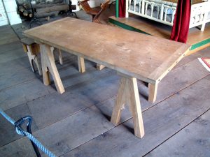
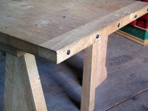
The reconstructed table in the room was a light-colored wood with clean lines and a low-luster finish. The surface of the English oak might have been burnished or had only a little wax on it. Except for a small Gothic arch in the base, that table would look fine in a French farmhouse, a Midwestern tract home or a New York loft apartment.
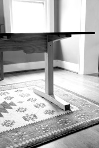
Same goes for the trestle table that I built for both Woodworking Magazine and my dining room. Different visitors have remarked that my table is ultra-modern, Shaker, 17th-century, or something out of Wallace Nutting’s “A Furniture Treasury.”
In truth, it is all those things. I have seen early trestle tables that would look quite modern if you didn’t stain them dark brown and then beat them like a rented mule with a bicycle chain to make them look “aged.” My table design was influenced by all those sources, and in the end, I sought to build it so it wouldn’t look out of place when put in any of those time periods. I thought that would be a difficult trick. It wasn’t.
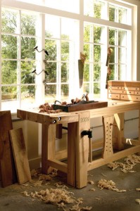
Other examples: Most workbenches and tool chests fall into these “elemental forms,” including the chest I built for the book “The Anarchist’s Tool Chest.” I drew my dimensions, joinery and shapes from examples of chests from the 18th to the 20th centuries. Once again, I tried to take the design features that were common from all the centuries to create a form that would look good in any of them.
But even pure ancient forms can look modern. After I built my 18th-century Roubo workbench in 2005 I had an architect call me and ask if it was OK for him to use that design for a modern dining table he was drafting for a client.
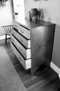
One more elemental form: chests of drawers. When I built the chest of drawers featured in the 1839 book “The Joiner and Cabinet Maker,” I was shocked to find how similar it was in both construction and dimension to chests of drawers from the 18th to the 20th centuries. That chest would look good in a Pottery Barn catalog. Right now I have it underneath and 18th-century-style wall cabinet and it fits right in there as well.
Some of these “elemental forms” do have some details that can peg them to a particular period in history. For example, with chests of drawers, the owner could “update” the look of a chest by asking a cabinetmaker to add some more contemporary-looking feet or to swap out the brasses. When helping my father examine antique English chests we ignored the brass and the plinth when trying to date the chest – however, these two features are usually what make the chest look good or look awkward. The funny thing is that my father’s oldest English chest actually looks the most modern.
So I have been trying to collect enough of these elemental forms of furniture to write about them and the features they share. I still have several years of searching ahead of me – this is a long-term project. But I do have some clues that you can look for during your own investigation of the furniture record. Here’s a short list.
1. A basic lack of ornament. Furniture styles tend to fluctuate between ornate and plain. You can have ornate carving on an elemental form, but it is only when the dictates of fashion cause that ornament to fall away that we can easily see the basic form behind.
2. Good joinery. This might be a chicken-and-egg problem, but I’m OK with that. Most timeless pieces of furniture are held together with time-intensive joinery. Did they use good joinery because they knew the piece was a classic? Or did the forms survive only because they were the ones made with good joints? Either way, good joinery and good design go together.
3. Simple proportions. George Walker has pushed me to explore furniture designs using my dividers, to look for whole-number ratios in the furniture I find appealing. Now many of my furniture books are perforated by pinpricks from my dividers. Again, I cannot say why these are associated with one another, but they are.
So if you see something, say something. Send me a note at chris@lostartpress.com if you have a candidate for an elemental form. Who knows – you might just help me get this book idea off the drawing board and into the book store.
— Christopher Schwarz
Good Design Resources
• George Walker’s blog and column, “Design Matters,” are must-reads for the woodworker who is interested in understanding the bones of good design.
• Walker has two great DVDs on design that are available at ShopWoodworking.com. “Unlocking the Secrets of Traditional Design” and “Unlocking the Secrets of Traditional Design: Moldings”
• “Illustrated Cabinetmaking” is not a book about elemental forms, but it is a book that will help you understand the different types of furniture and what distinguishes a wardrobe from an armoire.
Here are some supplies and tools we find essential in our everyday work around the shop. We may receive a commission from sales referred by our links; however, we have carefully selected these products for their usefulness and quality.




As a professional software engineer, the first thing I thought of was a common idea within software. Dr Christopher Alexander is a professor of Architecture at UC Berkeley and his core idea that Good Design is *objective* (eg, not *subjective*) to this day this makes him an “outlier” within the world of Architecture, not to mention Software Engineering, where his ideas revolutionized how many people write software to this day. He wrote a book, “The Timeless Way of Building”, which is now out of print. However, he felt that there were so many attributes of any type of home or structure that were … Timeless… …that that meant that our collective, cultural “eye” seems to somehow know what a “ranch style” home or a mid-century modern is “supposed to look like”. He felt the primitive design elements were such a constant.. and that certain combinations of certain elements were so “expected”.. that one could almost write a software program that could design a specified type of building. (To note, others in the software world appropriated his ideas; he did not advocate for his ideas to be used in the software world.).
James O. Coplien’s “Advanced C++; Programming Styles and Idioms” was the precursor to the book that made Dr Alexander famouns in the the world of software in the mid-90’s. The mid-90’s book was called “Design Patterns: Elemens of Reusable Object-Oriented Software” (Gamma, Helm, Vlissides). I know these are “software books”, but there’s content in there that might stimulate that curious mind of yours. As a pro s/w engr and an amateur woodworker, I see commonalities in the two, but they’re hard to explain. However, I’m hoping you might find some utitlity in reading about Dr Alexander’s work, as the search for elemental forms was a key area of his life’s work. From “Timeless Way..”
“In short, we may forget about the idea that the building is made up of elements entirely, and recognize instead, the deeper fact that all these so-called elements are only labels for the patterns of relationships which really do repeat.”
I think probably the most recognizable form in any era is a blanket chest. Start with a basic rectangular box, add some feet to get it up off the floor. I’m pretty sure cavemen made an example with ogee feet. It’s on a cave wall somewhere.
Can’t wait! Really hope you do this book.
“Looks good in a Pottery Barn Catalog” –
Absolutely nothing looks good in a pottery barn catalog…. 😉
Though not furniture forms, pyramids and obelisks always have struck me as both modern and ancient. Many of the criteria you highlight (simple geometric ratios, minimal adornment) obviously apply to these architectural forms, and certainly the overlap between appealing architectural proportions and furniture proportions would make some analogy between the two topical.
Case in point: the Memphis pyramid vs. (obviously) Egyptian pyramids.
I love the concept, and would be quite interested in seeing what you make of it!