We may receive a commission when you use our affiliate links. However, this does not impact our recommendations.
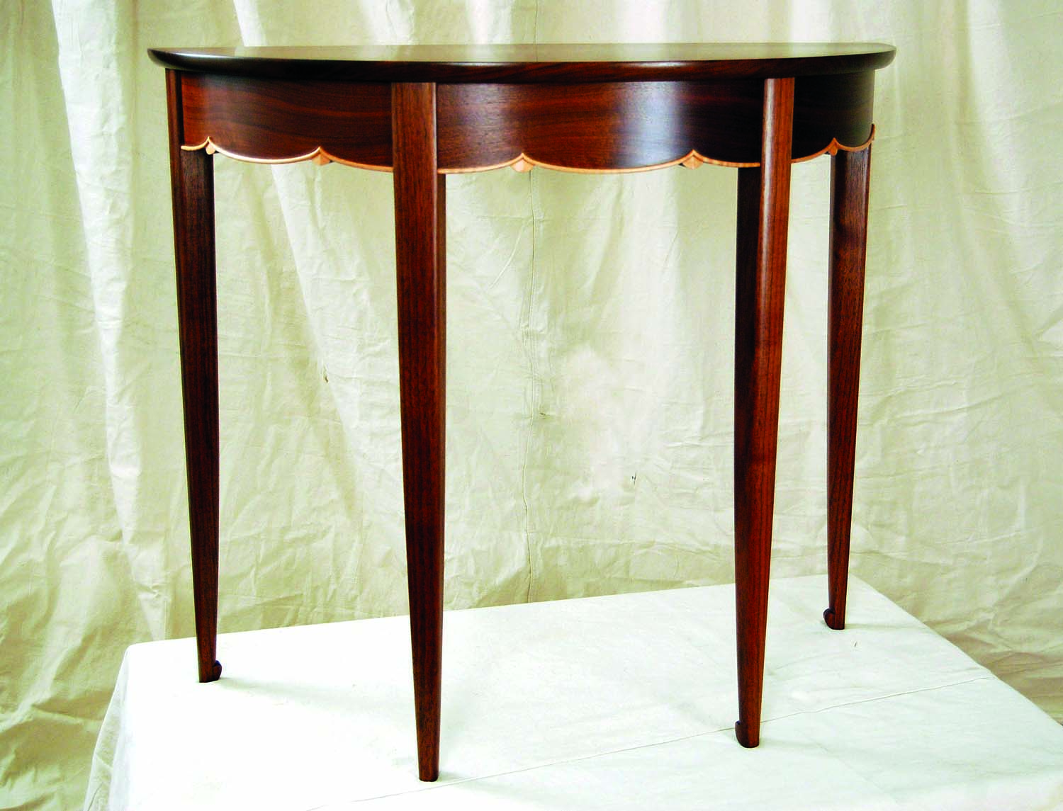
A perfect fit. The tapered legs on this table by Gerald Curry flow nicely with the overall form.
The black stallion’s name was Step.
Marvin, the only man I ever saw ride him, called him simply “the horse,” his raspy Southern voice pausing for emphasis. I was 5 years old the first time I laid eyes on Step. He was the scariest and most wonderful thing I’d ever seen. A force of nature, his frame all rough and muscled as though a master sculptor had chiseled him out in a hurry. His ebony coat reflected blue and purple in the sunlight, and the turf shook when he stomped his hoof. Perhaps the thing about Step that set him apart was that everything about him was perfectly proportioned. His massive iron-like legs would have been out of place on a lesser horse, but they fit perfectly with his body and muscular neck.
There’s a lesson there. When proportioning legs to a furniture design the legs need to reflect and connect with the overall mass they support. A workbench uses sturdy tree-trunk-like legs not just for structural support, but also because the hefty timbers visually support the massive top.
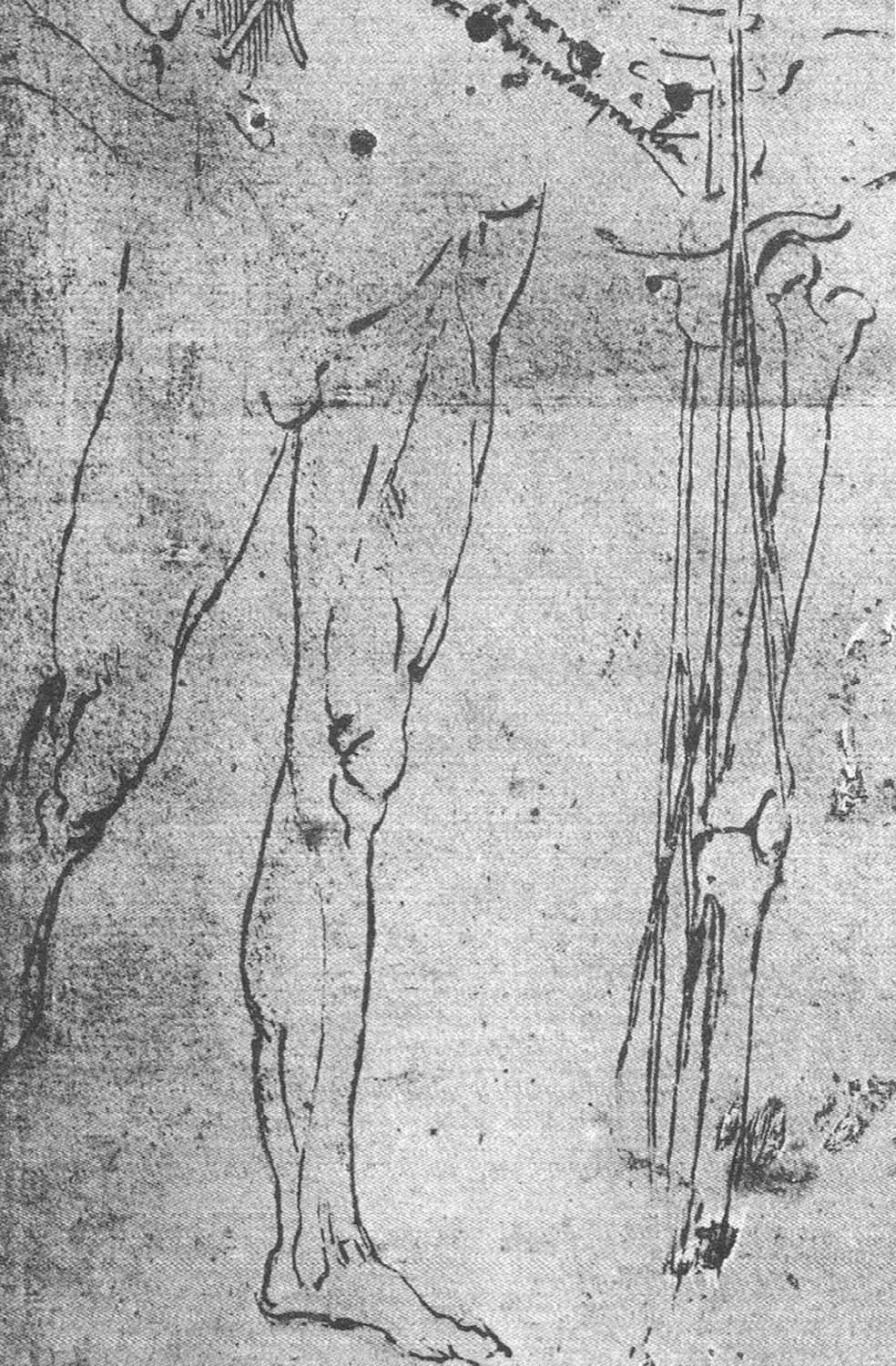
Natural inspiration. As this anatomy study by Leonardo da Vinci illustrates, human legs natually taper from thick to thin – the same approach often appeals on furniture.
I’ve been looking at legs on furniture and studying how they are proportioned. Because they play a key role in such a wide variety of forms, there are few rules that apply across the board. A light side table calls for a much thinner leg than a dining table, even though they are similar in height. Sounds easy, but it can be challenging to design a leg that’s sturdy enough and still looks like it belongs with the overall mass of the piece. I tend to make legs too stocky and have learned through my mistakes to scale them back. Make it a point to closely examine how the legs are proportioned in a variety of built work. Regardless of style, this can help you develop a good eye for proportions.
Add Some Taper
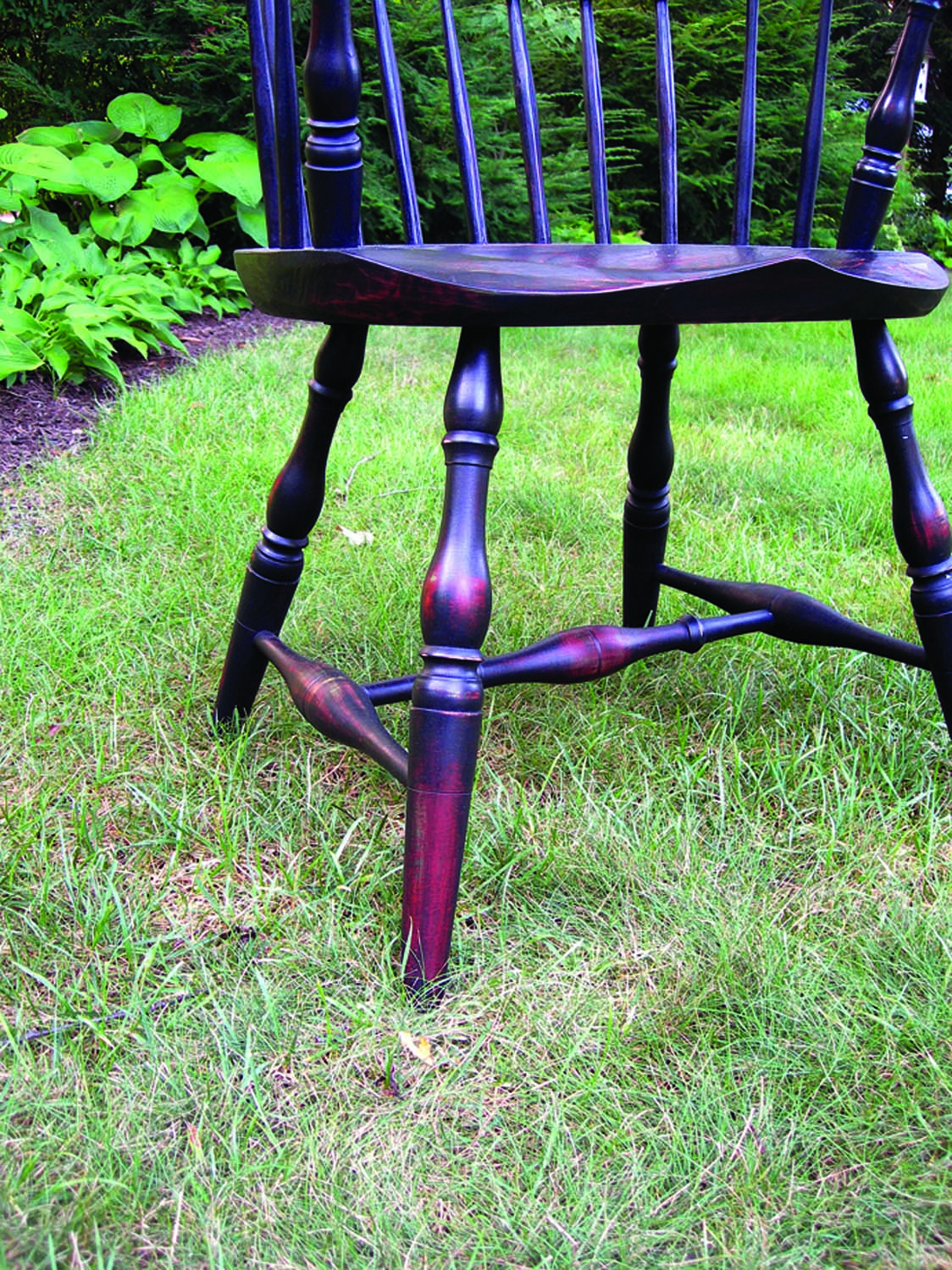
Nice legs. Tapers and curves are combined on the legs of this Windsor chair to add movement and visual interest.
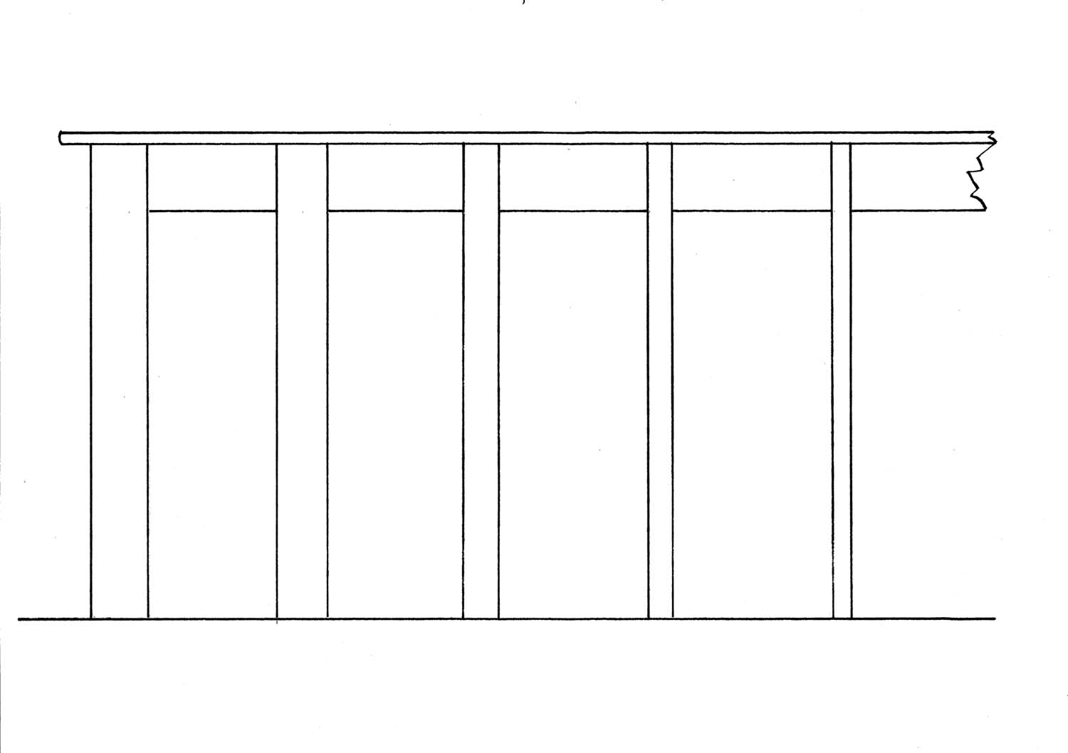
Thickness. Which of these legs looks most pleasing to your eye?
You can also design legs that complement by including some sort of taper, often with the leg heaviest where it’s joined to the table apron, case or chair seat. This is a traditional approach that mimics many of the forms we see in nature. Think about how your arms and legs are proportioned. Our limbs are thicker near our torso and taper down to our wrists and ankles. Straight legs work great for a workbench and supply a built-in square reference surface, but to my eye a straight leg pulls the life out of a chair or table design.
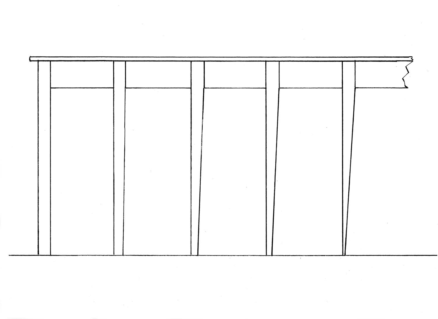
Progressive tapers. Sneak up on the right taper; you can trust your eye to proportion this.
But how much taper is called for? Too much and the profile can have a stiletto look that even appears structurally compromised. Too little and the leg looks static. I drew up the series of table legs above to illustrate. On the left is a straight leg followed by a series of tapered legs. Which looks most pleasing to you? Here’s how much each leg is actually reduced:
A – Straight
B – Reduced by a fifth
C – Reduced by a third
D – Reduced by half
E – Reduced by three quarters
I’ve looked at taper on a large number of built examples and regardless of whether they are simple or an elaborately turned or carved profile, most actually fall into a narrow band. They often reduce by one-third, one-half or slightly less than one-half. By that I mean they might be 2″ at the top and 11⁄8“ at bottom, or 11⁄2“ at top and 13⁄16“ on the bottom. This is a helpful starting point to keep in mind when designing legs, regardless of whether they are turned or square in cross section.
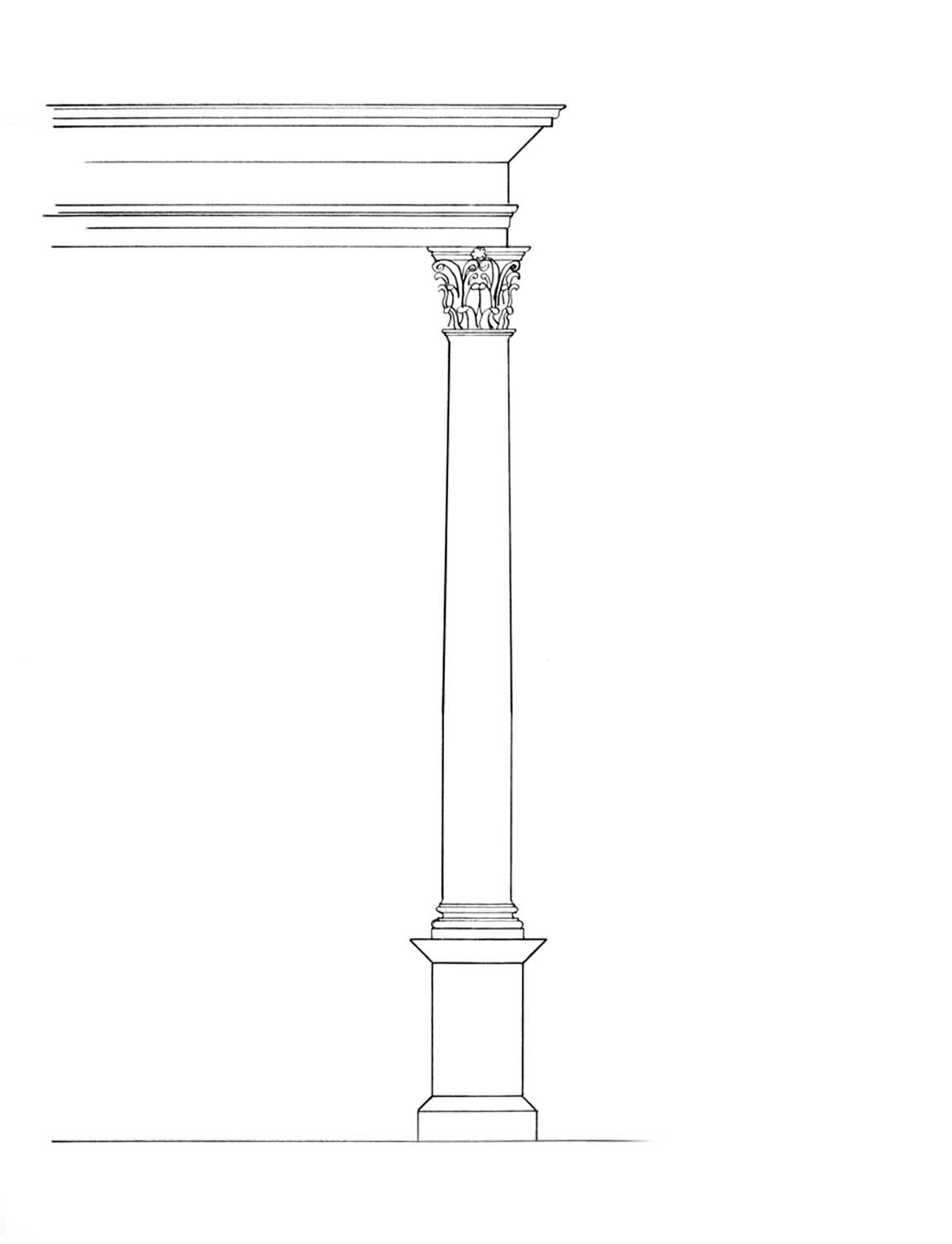
Subtle but effective. The column on this Corinthian order tapers gently from bottom to top by 1⁄6 of its diameter.
Another source that offers some insight on taper in a vertical element is a classic order. A classic order is an ancient form used in the construction of temples consisting of a column and a support structure above it. The lower third of the column remains constant, then begins to taper inward. Actually it curves in very gradually. This reduction in diameter probably echoes the natural tapering in the tree trunks first used in primitive construction. Usually the column is one-sixth smaller at the top than at the base.
Although furniture legs often taper in the opposite direction, getting smaller toward the floor, it’s important to note that a simple taper prevents a vertical element from becoming static and lifeless. As always, take this knowledge and look at built work. File away in your mind what appeals to you as well as what doesn’t. If anything, it’s more common to see a design lacking because legs are made too massive. A flag goes up for me when I see a design where the legs look a bit like they’ve been popping steroids.
Application
When sketching up a design, it helps to at least begin with a leg envelope that meshes with the overall form. I try to establish both the largest cross section and the taper. To avoid making the legs too massive, I start on the small side with a cross section just able to support the load then bump it up until it starts to gel with the overall mass, as shown above in the “Thickness” illustration.
If you’re not confident in your own eye, try this exercise. Sketch out your design with a series of legs that go from thin to bulky. Ask yourself which is too thin to your eye and which is too heavy. You’ll surprise yourself with how a leg in between these two meshes with the overall piece. With the mass of the leg established, rough in the taper. Start with a taper that reduces by at least a third and bump it further if necessary. Once that suits your eye, you can turn to detailing the leg.
At this point there are many options. You can add some curvature; it can be turned or carved. But establishing that envelope gives you a good jumping-off spot. You may just build a force of nature, something that comes to be known reverently in your house as “the chair.”
George is the author of the DVDs “Unlocking the Secrets of Traditional Design” and “Unlocking the Secrets of Design: Moldings“ both from Lie-Nielsen Toolworks.
Here are some supplies and tools we find essential in our everyday work around the shop. We may receive a commission from sales referred by our links; however, we have carefully selected these products for their usefulness and quality.


