We may receive a commission when you use our affiliate links. However, this does not impact our recommendations.
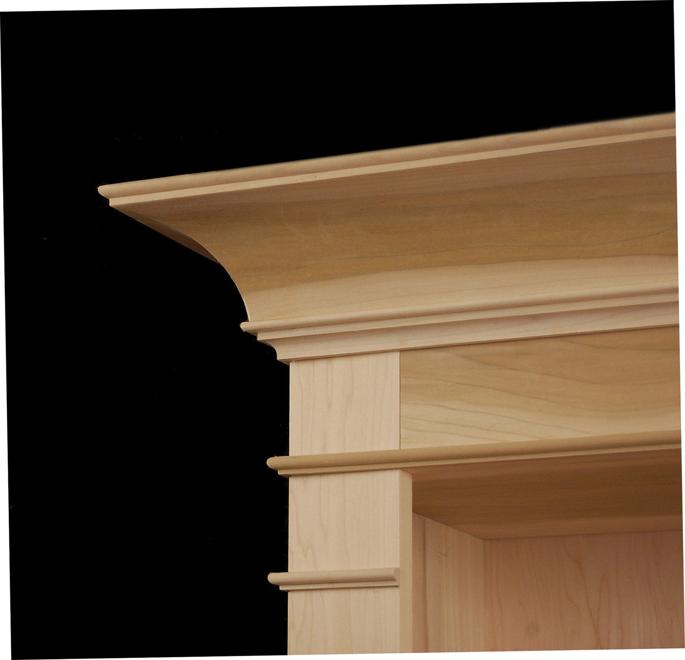
Bookcase crown moulding. Training the eye helps to bridge that gap between your rough idea and reality.
Awaken your inner design sense with just a little practice.
Talk about design often leads back to the idea of developing a good eye. For a long time I wrestled with this; it seemed a bit like trying to lasso the wind. I knew I wasn’t alone, either. Frequently I talk to woodworkers who struggle with making design judgments by eye.
I hear them say, “I look at a piece of furniture and I know in my gut something’s a bit off, but I can’t quite put my finger on it.” It may be just a simple detail like sizing the rails on a frame-and-panel door. You know there’s a fine line between sturdy and clunky – it’s just not clear where that line is.
If that happens to you, your inner design sense, or eye, is telling you something. The good news is that you can train your eye. It’s not something learned in a day, but just like mastering a skill like sharpening a chisel, your eye can be trained. You’ll be able to tackle design problems with renewed confidence and even venture out creatively further than you thought possible.
Part of my difficulty was thinking that I needed to look closer, see more acutely. Now I know it’s not so much about seeing keenly, it’s about seeing differently. Often it’s seeing the obvious but in a new light.

Mature oak. The spreading trunk echoes the pyramidal and anchors the tree both structurally and visually.
I remember one of the first times this happened to me. I had a good friend named Rudy as I was growing up. We both loved the outdoors and Rudy had an amazing knowledge about everything in the wild. It was through his eyes that I noticed the killdeer returning long before other songbirds, when the ground was still cased in snow and frozen hard as tundra. Or to look for the leaves sprouting on the shadblow twigs because it meant the smallmouth bass would start feeding in the deep pools on Beech Creek. I can remember clearly a day we stopped for lunch in the shade of an ancient hemlock. Rudy plucked a small patch of green, a sprig of lichen from the rotting log we sat on. He held it up to a shaft of sunlight and it sparkled with a flash of scarlet. “It’s called a British soldier,” he said. “See the red jacket?”
I blinked my eyes in wonder, and then looked again at the brown rotting wood and pine needles on the forest floor. A whole army of bright tiny redcoats stood in formation where a few moments before I’d seen nothing. I remember thinking they were so obvious and wondered why I couldn’t see them until he pointed them out. Training your eye is a bit like discovering those redcoats. Michelangelo had a proverb: “It is necessary to keep one’s compass in one’s eyes and not in the hand, for the hands execute, but the eye judges.”

Montana sunset. Who doesn’t enjoy a great sunset? Learning design is about making connections we can relate to.
Some might argue that the whole idea of making judgments about what looks right is entirely subjective. Yet, we can’t ignore the fact that as humans we are wired a certain way. How do we explain the pleasure we feel in hearing a wren sing its heart out in spring? Why are we dazzled by sunsets? Designers have been tapping into that hard wiring for thousands of years and some timeless design knowledge has grown out of that.
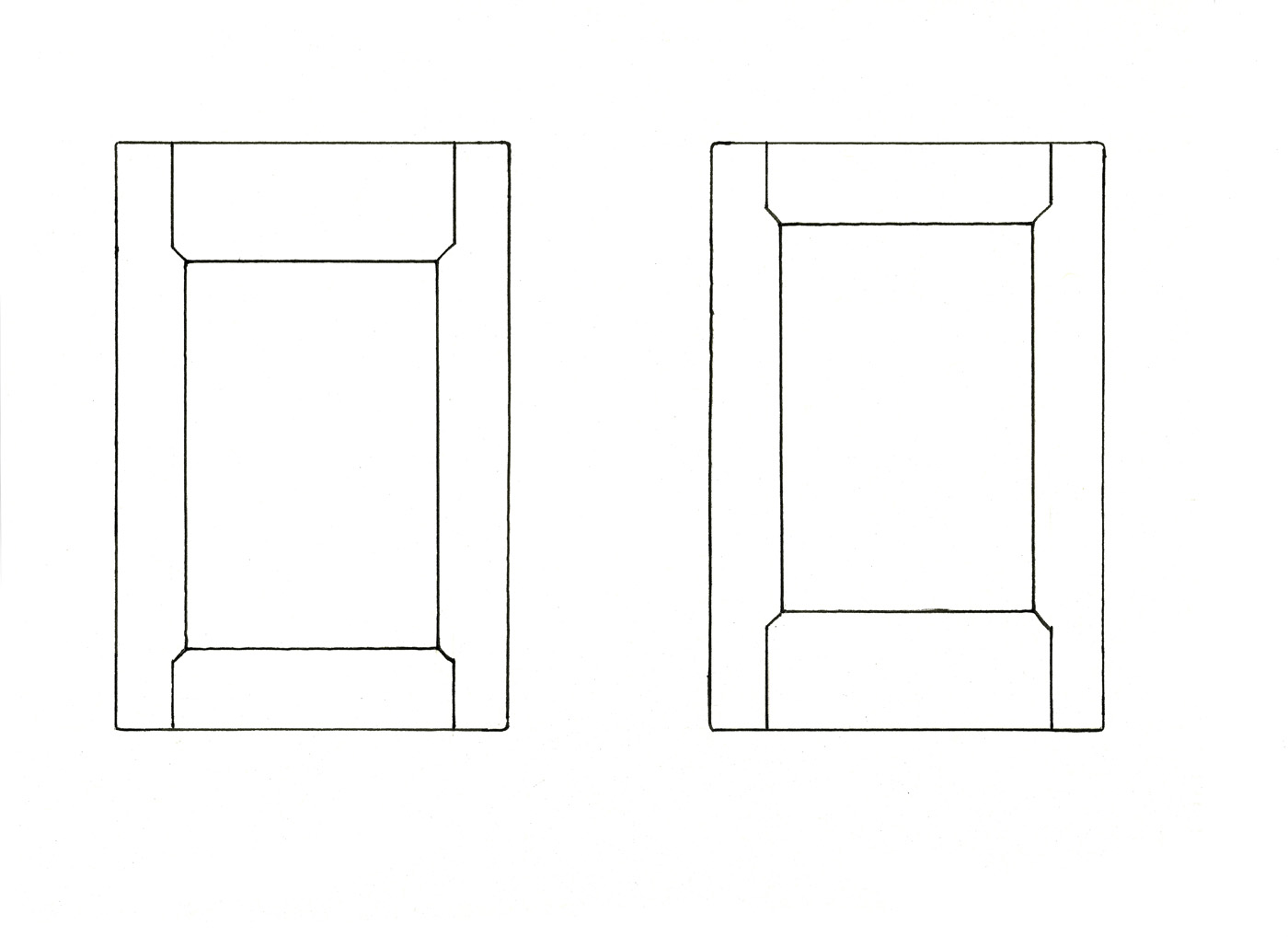
Frame-and-panel door frames. On these two examples, the top and bottom rails are weighted differently. At first impulse, which looks right?
Application
Let’s illustrate with a simple example and go back to those rails mentioned earlier on a raised-panel door. Frame-and-panel construction is a solid solution to filling a door opening. Stiles and rails are joined together to provide a strong frame that holds a wide panel, allowing it to shrink and swell. Did you ever notice how the rails (horizontal frame elements) are sized on doors? If the goal is efficiency, just make all the rails and stiles of equal widths. This is an all-too-common approach today in cabinetwork.
To create some visual interest, another approach is to proportion the rails to the overall height of the opening and make one larger than the other. In the two examples shown above, one has the visual weight on the top rail, the other on the bottom. Which example does your eye judge as more appealing? Most would answer the one on the right – and with good reason. Examples in nature abound where the visual weight is heaviest closest to the ground and becomes lighter as it rises, as with tree trunks and mountains, to name but a few examples. This is referred to as “pyramidal” and is often applied to elements such as rails, or drawer fronts on a chest.
A simple method to proportion rails is to divide the overall height into five equal spaces and use the bottom fifth to size the lower rail. Then take the remaining space above the lower rail and divide it again into fi ve or six equal parts. Use the top unit as the height of the upper rail. This will also link the two rails proportionally.
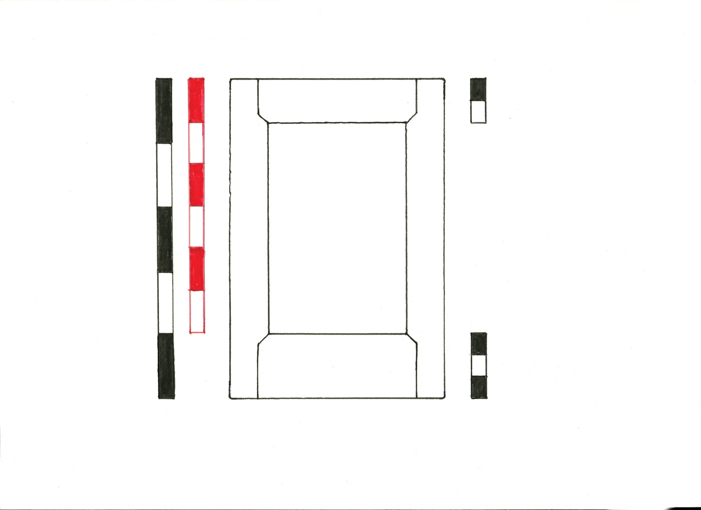
Proportion the rails. Using simple divisions you can size top and bottom rails both to the opening and to each other.
If you divide by five, it will make the upper to lower rail a ratio of 4:5. If you choose to size the upper rail by dividing by six, the top rail will have a ratio of 2:3 with the height of the bottom rail. You may feel the rails still look a bit heavy to your eye. That’s OK; this is meant as a starting point to get you in the ballpark. It’s perfectly fine to scale them back further. Just make sure the top rail is scaled back also, keeping that 4:5 or 2:3 ratio intact. Also, don’t get hung up on the method. I happen to like this approach because it’s simple and quick. The principle is more important than how you get there.
Ongoing Study
The focus of the Design Matters column was exploring basic design principles or rules. Some folks are glad to have rules and welcome them as building blocks – sort of a paint-by-number or connect-the-dots approach – but that’s not how it works. Design comes down to making judgments based on your eye, and no rule can make the final call. On the other end of the spectrum are those who want to learn the rules so they can break them. Our Western design heritage is rich, precisely because designers have always pushed the rules. But I’d like to suggest a third way to view rules. They can help us to see differently. Here’s how:
Understanding design basics can help you to recognize and appreciate great design in masterful work. Great furniture, art and architecture can become a tremendous source of inspiration and training. That courthouse you’ve been driving by for years might be a textbook on proportions. Visits to a museum or historic site take on a whole new meaning as you understand more of what you see. It will change the way you see furniture. Your eye will reveal layers hidden within a great design – starting with the bones beneath the surface that define the form seen from a distance, to the subtle restraint that allows an inlay or carving to delight when seen up close.
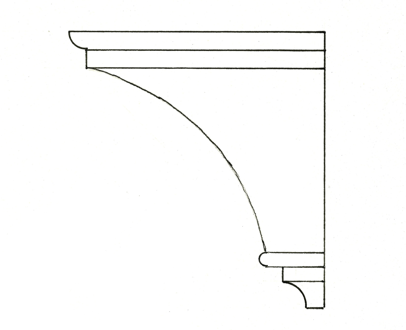
Idea sketch. Design skills can help you imagine how your idea will look at every step, from drawings to the completed work.
A foundation in basic design principles also can give you the ability to see where you want to go with your design and have it come out the way you imagined it. This is often one of the hardest things to tackle. It’s difficult to clearly see how a design will look while it’s still just an idea rattling around in your head. Today we have wonderful technology to see an image in 3D on a computer screen, yet there is no substitute for developing that inner design sense and the ability to visualize.
Basic design knowledge can offer a starting point to begin roughing in your idea. Starting out with good bones makes a huge difference, and it’s amazing how much creative latitude you have. Many designers often compared the visual arts with music and for centuries saw a linkage between proportions and musical tones. A ratio of 2:1 equals an octave, 2:3 is a fifth, etc. The really exciting thing, if we think about design in that light, is that music can be expressed in so many ways. The same notes used to create a symphony by Bach find life in the music of John Lee Hooker or Bruce Springsteen. Don’t be afraid of the rules in a confining sense. View them as a key to unlock your creativity.
Finally, an important step in training the eye is to imprint the lesson by looking carefully at how it’s been applied skillfully or sometimes clumsily in other work. Take time to look at how the top and bottom rails are sized on older cabinet doors, entry doors, even old window sashes. If anyone asks what you are doing, tell them you’re looking for redcoats.
Here are some supplies and tools we find essential in our everyday work around the shop. We may receive a commission from sales referred by our links; however, we have carefully selected these products for their usefulness and quality.


