We may receive a commission when you use our affiliate links. However, this does not impact our recommendations.
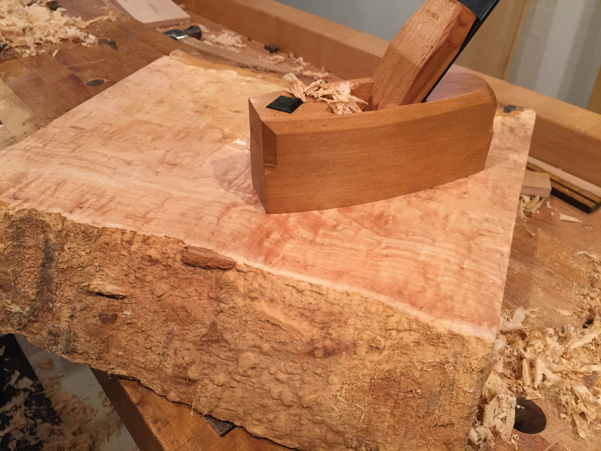
There’s something magical in that moment when a rough chunk of lumber reveals its inner gems.
Rustication adds a sense of nature to refined designs.
One of my favorite places is a neighborhood Italian market called DeVitis. Every time I step through the door, I stop and let the smells of a great kitchen waft over me. Italian sausages and cheeses, sauces and whatever is on special that day grab my nose and render me helpless. And to make matters worse, someone’s likely to ask me to try a cannoli or some bread straight from the oven with garlic butter. That glorious kitchen aroma gets me every time. Yet oddly enough, when I have wandered around the store for a few minutes, that rush of culinary goodness seems to fade. I can still smell the aroma but don’t have that dramatic rush like those first seconds when I stepped from the street into that intensely charged slice of Italy.
Our senses and perceptions are acutely sensitive to contrasts. When our sight or touch or smell has grown accustomed to one thing, we sit up and take notice when we sense a change. Perhaps it is hardwired into us from millennia of surviving in a hostile world, always on the lookout for danger or opportunity. We sit up and take note of changes hitting our senses. Everyone can remember a quiet place, somewhere peaceful, a spot we can escape to and rest. But there is nothing so profoundly silent as the moment when we shut down a roaring chainsaw that has been pounding our eardrums.
I can recall some quiet memories in the outdoors or in a great cathedral, but nothing is as quiet as when a bustling factory powers down and puts the roar of the machines to rest. In those first moments when the noise is sucked from the air, a dripping faucet sounds louder than a locomotive. It is the contrast that amplifies.
Nature Amplifies Craft
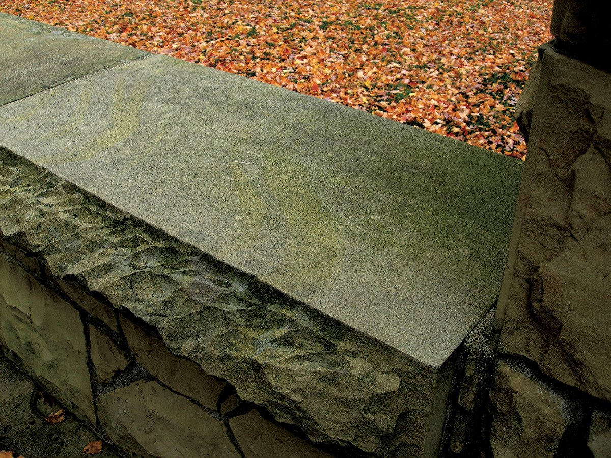
1. The jagged edge plays off the smooth face and creates something visually more exciting.
Our craft tradition has a long history of finding ways to use contrast to surprise and delight our senses by the work of our hands. No doubt artisans of every age relished the moment when a rough chunk of wood unveiled its beauty under a sharp plane iron. One of the oldest and most revisited techniques to show that magical transition is rustication.
Rustication is something used by designers to highlight a high level of craftsmanship. Rustication is creating a contrast between a surface with a natural organic texture and an adjoining surface that has been smoothed or polished. In architecture we see this with the use of border materials made from rough-textured stone around a field of much smoother bricks or polished stone (above). In woodworking, using a live edge on a tabletop is an example of rustication. The irregular undulations of the edge as nature created it helps our eye appreciate the smooth tabletop and its polished surface. That contrast of rough and rugged emphasizes the smooth
and polished.
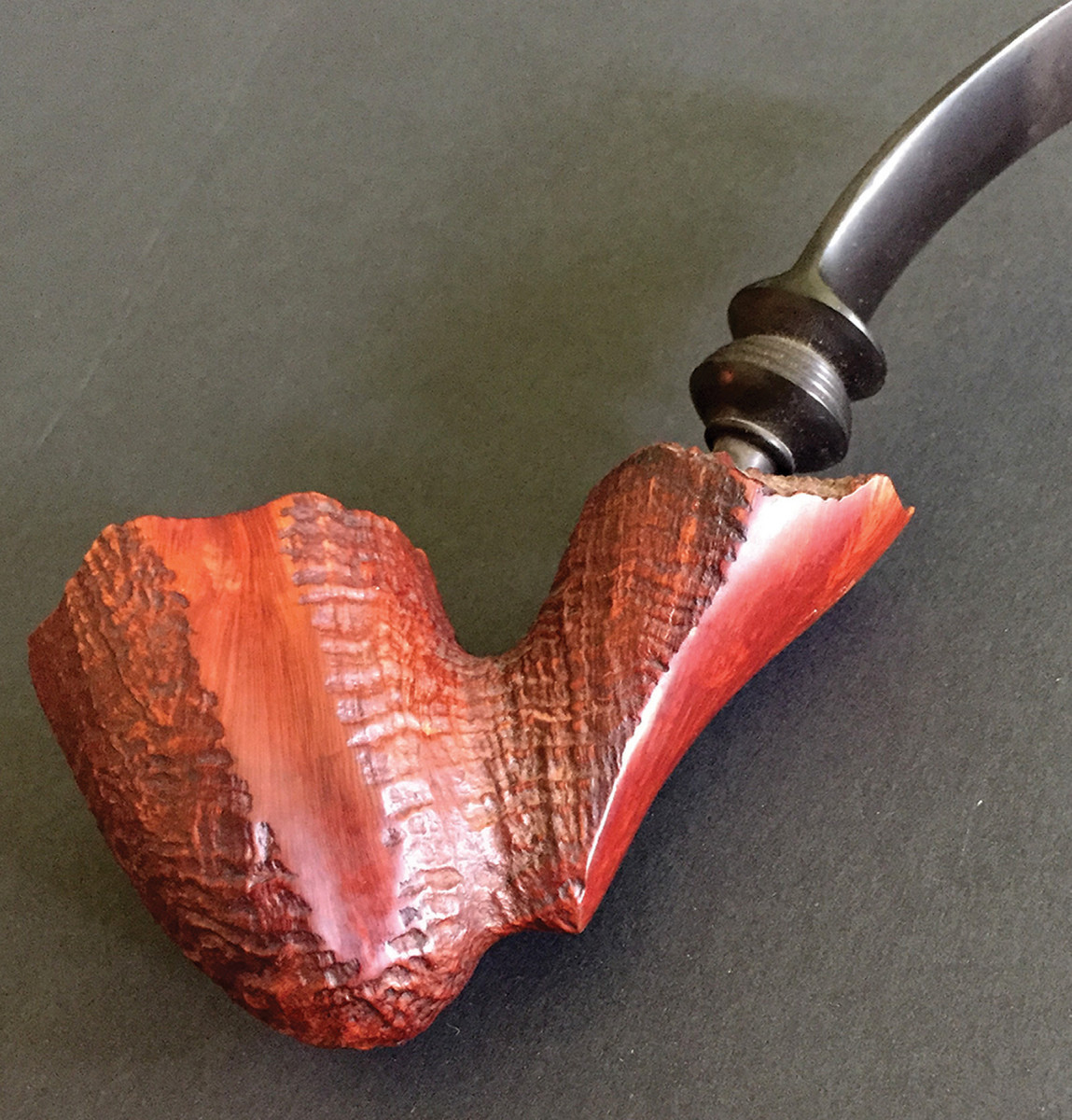
2. Rough versus smooth pops up everywhere and offers little gems of inspiration.
Library of Ideas
The use of this rough versus smooth goes back into antiquity in architecture and cascaded into all the building and decorative arts. Masons often used rough-textured material in the first courses of stone above the ground. It gives the impression that the building emerged organically from the earth itself. They also used it as border material around windows and doors. It highlights the smooth glass openings and plays off the smoother wall surfaces. Sometimes they peppered a composition with bits of rough stone bursting out as though to say, these walls and columns were fashioned from nature herself.
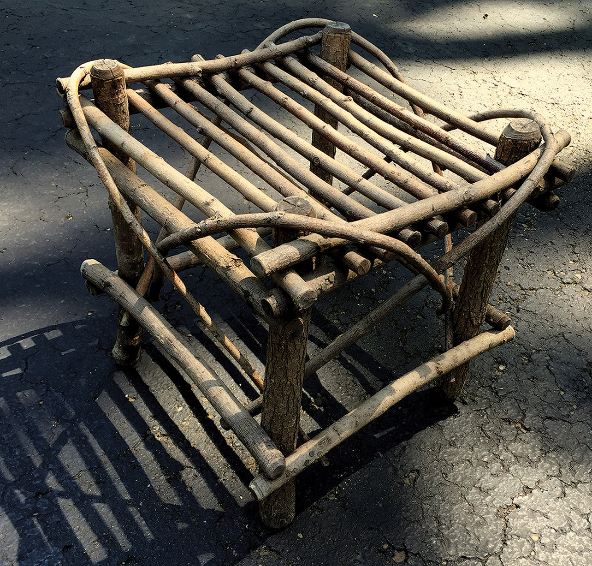
3. Rustic furniture is all about con- trast. It’s the opposite of all our highly finished, machine-perfect surfaces.
One thing you’ll no doubt encounter will be work where the builders lost sight of the power of contrast and fell in love with rugged surfaces for their own sake. In those cases, designers make everything rough. We see that in some buildings where all the stone is rough hewn or in Adirondack twig furniture where all the material is straight from forest to table (above). This can sometimes provide some contrast if we place a rustic piece of Adirondack furniture in a more refined setting, but in and of itself it no longer is being used as a method of contrast. My own sense is that the contrast is most powerful when the rough surfaces play a minor role and do not try to compete or overwhelm the adjoining surface they’re highlighting.
Artificial Rustication
One of the risks of using a natural surface is that it can be so irregular that it overwhelms the effect we’re after and becomes visually chaotic, or it’s so irregular it doesn’t easily fit into the composition we’re trying to create. Rough natural material may not lend itself to an orderly border. Enter craftsman-made natural textures. Artisans often created that contrast between rough and smooth but instead of nature they used mallet and chisel to create natural looking rough surfaces. Much of the rusticated work found in buildings and furniture is actually this craftsman-executed texture .
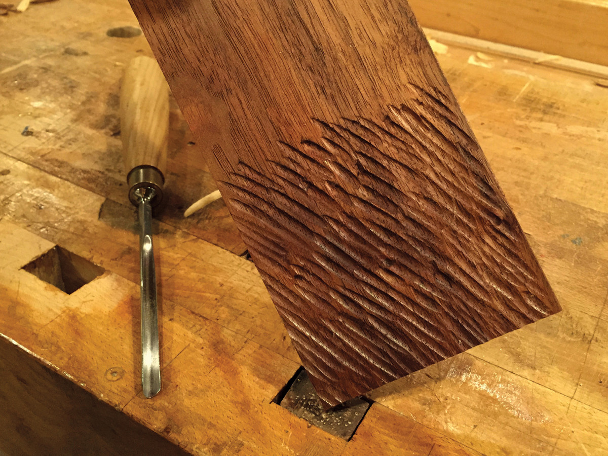
4. A sharp chisel can act as nature’s sculptor.
The beauty of this for a woodworker is that it means we can create our own rough and smooth contrasting surfaces with endless possibilities. Regardless of whether the rough surfaces are made by the rhythms of wind and water or the rhythms of mallet and chisel, from a design standpoint, the effect is to achieve a contrast that calls to our senses. Think about that the next time you stumble across a bit of rustication. It also helps to ponder it over a plateful of lasagna.
Here are some supplies and tools we find essential in our everyday work around the shop. We may receive a commission from sales referred by our links; however, we have carefully selected these products for their usefulness and quality.


