We may receive a commission when you use our affiliate links. However, this does not impact our recommendations.
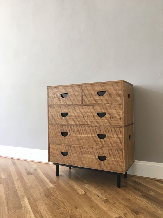
When I build a piece for a customer I show them the drawing and build it (mostly) to the print. But when I build a spec piece, such as this modern campaign chest, the customer is my eyeballs.
And so this is the part about design that doesn’t get talked about much: If something bugs you about a piece you’ve made, fix it or destroy it. I am happy to chop up a piece for firewood that didn’t deserve to see the light of day.
But in this case, the only thing that bothered me was the plinth. After living with the plinth for a week or so I knew I wasn’t happy with it because I kept sketching plinths.
What was I unhappy with? Its footprint was just a little small – about 2-3/4” too small. And it was a little too tall – by about 2”. So I built another one. And another.
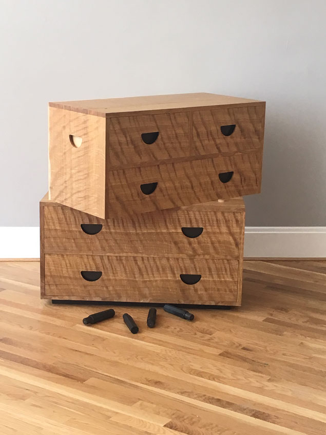
The other thing I fixed is that I wanted the chest to be more portable, much like a traditional campaign chest. Ideally the base should disassemble and fit in one of the drawers.
The base shown above does just that. The four tapered octagonal legs are friction-fit into two 1-3/8” x 3” x 36” strips of wood screwed the underside of the lower case. I wanted to thread and tap these joints but I was trying to keep the project as simple as possible for a magazine audience.
I am now 100 percent happy with the piece and can walk away from it. Kids can draw on the drawer fronts with crayons. Customers can fill it with oats for their horses.
And that is how I deal with design work – care like crazy (a little too crazy) until I reach my goal. Then I’m done and ready to move onto the next project: a traditional ladder.
— Christopher Schwarz
Here are some supplies and tools we find essential in our everyday work around the shop. We may receive a commission from sales referred by our links; however, we have carefully selected these products for their usefulness and quality.


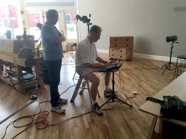
Like the new photo wall. Lots of natural indirect light, clean lines from the baseboard and bias-laid flooring.
You should paint the wall to match the magazine background colour for the issue each article you write goes in, just to mess with Megan. 😉
Chris, I love the piece but like the idea of threading the legs on and off. Ever since reading Campaign Furniture I’ve been trying to come up with less expensive versions for the “just out of college” crowd. These are pieces I wish I had at that age when I moved about every 18 months.
I don’t think I’d want the legs threaded as I don’t have that equipment. Have you had good luck with any hardware like threaded inserts with hanger bolts? I’m also thinking of your Knockdown Nicholson design but in that case it was just bolts to a thread insert.
Any thoughts from you or the audience would be appreciated.
Thanks,
Shawn
The drawer pulls are backed with brass that is painted black. The lifts on the side are merely backed with the drawer sides. I thought about painting them black, but decided against it.
This is just a beautiful piece. I had a question about the drawer pulls and side lift holes. I think you talked about backing them with brass or something. The drawer pulls appear black as do the right-side hole, but the one left-side hole appears to be light colored. What did you, in fact, end up doing?