We may receive a commission when you use our affiliate links. However, this does not impact our recommendations.
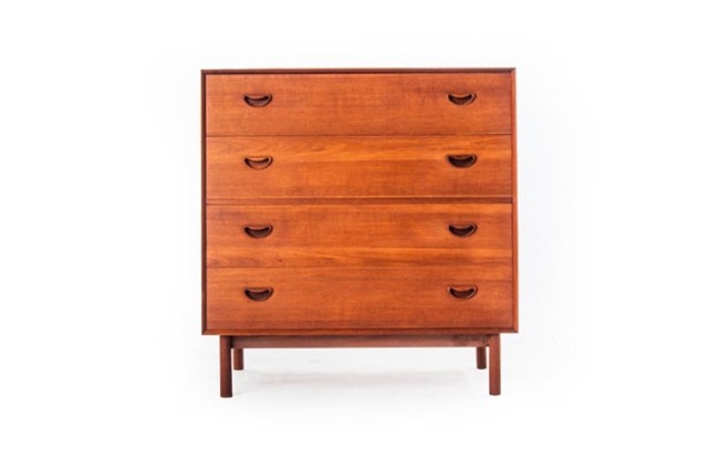
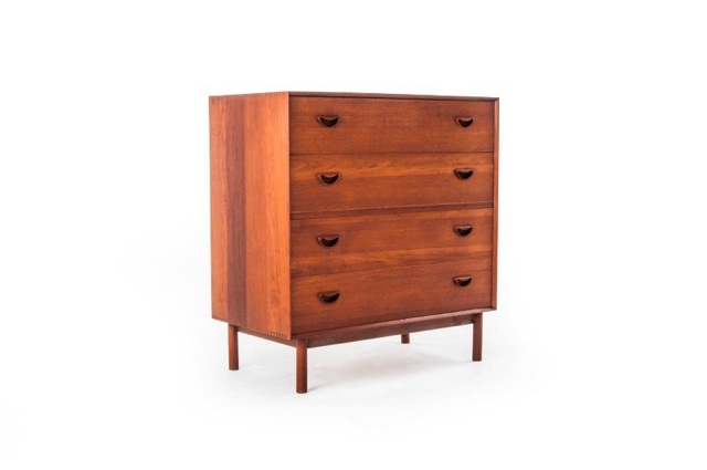
A lot of Danish Modern dressers are taller than your typical campaign chest because the designers added a drawer or two. But some of them look like the pieces shown here.
After staring at the 25 campaign chests from part 1 of this series I hope you can see the connection. We have an unadorned dresser that is square and perched on a plinth.
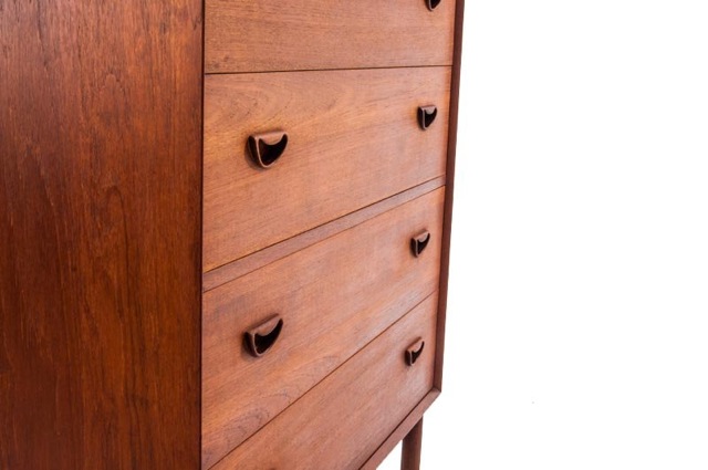
Just like a campaign chest, the pulls on these Danish Modern chests are nearly flush with the drawer fronts and mimic the shape of a traditional swan-neck pull. They are carved from wood but aren’t all that radically different than the shapes you see on older traditional chests.
Good Danish Modern design tips its hat to traditional design like this quite a bit.
The plinth (base) on these Danish Modern chests and others raise the chest off the floor like the removable turned feet on 19th-century campaign chests. The only real difference (to my eye) is the legs are a bit thinner and a couple inches taller. You can say they look radically different, but I think it’s more important to look for similarities than differences.
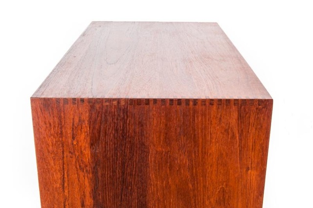
The joinery on the Danish chests is modern, but similar to the joinery used on campaign chests. Campaign chests used rabbeted dovetail joints. This chest used finger joints. Both joints are quite robust and designed to last generations.
After soaking in the Danish Modern details, here’s what I decided to do: To design a drawer pull (and chest lifts for the sides) that mimicked the shape of traditional pulls, yet was simpler, less mechanical and flush with the drawer fronts and carcase sides. This brought the piece in line with both traditions.
I sketched a wide variety of shapes for the pulls (which I’ll cover in the next installment of this series) to attempt to generate something that looked right. In the end it became a half-circle.
For the base, I also hit the sketchbook and tried to design something that straddled the line between Danish Modern and Campaign. In looking at both traditions, I knew I needed four legs. The visual weight of those legs would push the design either forward or backward in time. So I struggled a lot to get it right.
So this is the point where I begin to sketch and sketch until something starts to take shape. Each drawing takes no more than 45 seconds to do so I can rapidly attempt and discard non-starters.
I now know the form and its overall size. The details are beginning to take shape, but I still haven’t worried about joinery. It’s usually an easy decision, so I can put it off for a while until the rest of the chest takes shape under my pencil.
— Christopher Schwarz
Read part 1 of this design series here.
Part 2 is here.
Here are some supplies and tools we find essential in our everyday work around the shop. We may receive a commission from sales referred by our links; however, we have carefully selected these products for their usefulness and quality.




Such a wonderful Chest Chris, very powerful, such great simple details. Fitting of the drawers and the edge profile draw the eye to the center. Thanks for image and design thoughts!