We may receive a commission when you use our affiliate links. However, this does not impact our recommendations.
When you open the October 2016 issue to the Letters and Tricks of the Trade columns, you’ll notice a new look. With this issue (it begins mailing on August 3), we welcome Martha Garstang Hill as the technical illustrator for Popular Woodworking Magazine.
It has been difficult to say goodbye to Mary Jane Favorite, who’s been doing our drawings for many years (more than two decades, I think!) – but she and her husband, Nick Engler (author of “The Workshop Companion” series of books and scads of woodworking articles) are busy with preparations for an exciting (and extended) aviation-education adventure to China (read more about that in this article from The Dayton Daily News).
But I know Martha will be just as fun and easy to work with – and we “know” her already (you might, too!); she did the illustrations for “The Perfect Edge,” Ron Hock’s excellent book on sharpening. Plus, her work has appeared in Fine Homebuilding, Threads, Inspired House and other magazines, as well as in many other books.
Martha holds a B.A. in art, and is a licensed architect as well as a technical illustrator, and she lives just a stone’s throw from Ron Hock and the College of the Redwoods – if she needs to check out a technique or talk over a woodworking method in person, it’s but a short walk. (But that would mean I haven’t done my job well…so I hope that never happens!)
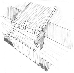
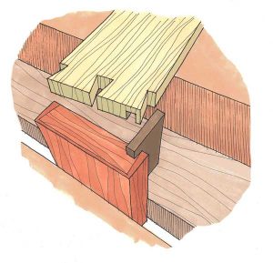
Martha’s style and way of working is a little different than MJ’s – instead of doing final drawings in illustrator in layers (MJ’s approach), Martha does all her work by hand, adding color on the page, not on the screen.
So we adjusted our look to fit her technique, dropping the colored box that has formerly been behind the winning trick and the lead letter in each issue. Otherwise, our designer, Dan Pessell, would have to outline the illustrations to run the screen behind them (and in the interstitial spaces, such as the white space between the clamped-up board in the drawing at left). But because Martha’s work is so colorful, the screen really isn’t necessary – we felt it would compete with the illustrations.
You can check out more of Martha’s work on her website at garstang-hill.com, where I encourage you to take a look at the “Architecural” tab – I particularly like the line drawing of the Victorian house. And look for her illustrations in upcoming issues. I hope she’ll like working with us, and do so for a long time!
P.S. Please Subscribe now so you a) don’t miss an issue b) save more than half off the cover price c) help me afford cat food.
Here are some supplies and tools we find essential in our everyday work around the shop. We may receive a commission from sales referred by our links; however, we have carefully selected these products for their usefulness and quality.


I hope that is not the final drawing, as it is missing the middle pin.
Hardly the best image to use to introduce us to a new artist.
I am very excited to see Martha’s illustrations on the pages of PW. The fact that she prefers the pencil and pen upon the computer generated vectors is really admirable. I am sure that many, perhaps even all, our readers will appreciate this too.
I was struggling with getting exactly what the illustration is showing when it just jumped out at me with the addition of the colors – you cut the rabbets in the mating pieces first, then you use a small “guide” piece to align the two pieces for marking via the rabbet, then, when you mark out and then cut the hidden dovetails, you stand a chance of the three intended pieces actually fitting together. Nice.
I wish I could draw as well as her rough sketch. And Megan, go vegetarian rather than eat cat food. You know it makes sense.
A perfect choice. Her work will compliment the ensemble you already have. Roy with his simplistic approach to quality woodworking from days gone by, Chris, for his studious attention to the historical accuracies, and purist approach, and you Meagan, for organizing the jumbles of words into prose we can absorb – and understand.