We may receive a commission when you use our affiliate links. However, this does not impact our recommendations.
When it comes to building chests of drawers, most examples I’ve seen since the 18th century and later have drawers that graduate from top to bottom.
Bigger drawers at the bottom; smaller drawers at the top.
This arrangement wasn’t always the case: 17th-century chests of drawers would commonly alternate shallow and deep drawers – deep, then shallow, then deep, then shallow. Read David Knell’s “English Country Furniture 1500-1900” for more on this topic.
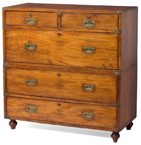
Recently as I’ve been wading through hundreds (thousands?) of images of campaign furniture my own expectations about graduated drawers have rebooted. Campaign chests in particular regularly violate my modern expectations about graduated drawer sizes.
And now I’d like to violate your expectations as well.
Below is a gallery of a small sample of images I’ve collected on campaign chests. They are mostly English, and range in dates from the late 18th century to the early 20th. When I first collected these images, the forms looked a little awkward to me because of the drawers. Since I’ve been living, breathing and building this stuff, my eye has changed. Look at these images long enough and I think you might see what I see.
Why do these forms not have traditional graduated drawers in all cases? In many cases these chests had a fall-front desk, or secretary, built into one drawer. That drawer needed to be at a certain height and it needed to be tall enough to handle the pigeonholes, doors and drawers in a gallery.
When this pure functional requirement was grafted onto the 40” x 40” x 18” skeleton of a chest of drawers, you can see how the traditional idea of graduating drawers would be difficult to execute.
— Christopher Schwarz
Here are some supplies and tools we find essential in our everyday work around the shop. We may receive a commission from sales referred by our links; however, we have carefully selected these products for their usefulness and quality.


I really like the hardware on the first chest (64-01).
It is the only example (at least in this post) with brackets that encompass both sides of each corner, and they frame each drawer in a way that gives the chest a very indestructible vibe.
Do the ‘T’ brackets in between the drawer rows echo the same shape on the sides?
Also, how do the secretary portions vary from chest to chest?
Peace,
Jason
It’s always interesting to see the concept ‘Form follows Function’ in another way. Function will always dictate the form of an object even if it means bucking past trends.
As dressers they may look odd, but as desks, everything falls neatly into line.
Of course, the Shakers never drank the Kool-Aid on graduated drawers, but then their stuff is usually dull as dishwater unless you really go in for it. Putting the big drawer up high does have the very real benefit of putting a heavy, laden drawer up at waist height where it can be comfortably man-handled, not down near your ankles. The complexities of mobility and a fold down secretary make the graduated drawer aesthetic non-pertinent.
Even though graduated drawers look great and are most common. I grew up with furniture that was built by my grandfather and several of his chest of drawer had secretary built into them and a narrow drawer at the bottom, the form looks as natural as a graduated drawer chest to me.
To my eye, the late 18th century chests with the bracket feet look more stylish (?) & better proportioned.
Note also that some of these chests appear to be in two parts, which dictated the layout & design of the drawers vis a vis the carcase, forcing a 50:50 vertical division.
Interesting post, Chris.
That these chests look good with their unconventional drawer size gradations demonstrates the problem with following formulas in creativity. There’s lots of good ways to design. It is certainly worthwhile to be aware of, and understand, common practices of design, but following them by rote is dangerous and not much fun.
In these chests, the side-by-side pair of drawers somehow resets the eye, and makes the lack of size gradation in a single direction look more pleasant.
Rob
Chris,
To me, the bunch look a little awkward at first, just like you say. The top-middle chest manages to look nice to my eye anyway because of the horizontal break added by those outboard drawers. I really like that one at first glance. Thanks for sharing all the pix.
Dave
Chris –
“…I’d like to violate your expectations”. Geesh, you could at least buy me a beer first.
I don’t really know much about campaign furniture, but if the idea is that they are stackable pieces, I would think that graduated drawers wouldn’t work from a functional or aesthetic aspect, since each section could be re-stacked in different orders. One week the small drawers would be on top, the next they would be on the bottom. And small drawers on the bottom would look pretty weird… especially on you Chris.
Jonathan
========================