We may receive a commission when you use our affiliate links. However, this does not impact our recommendations.
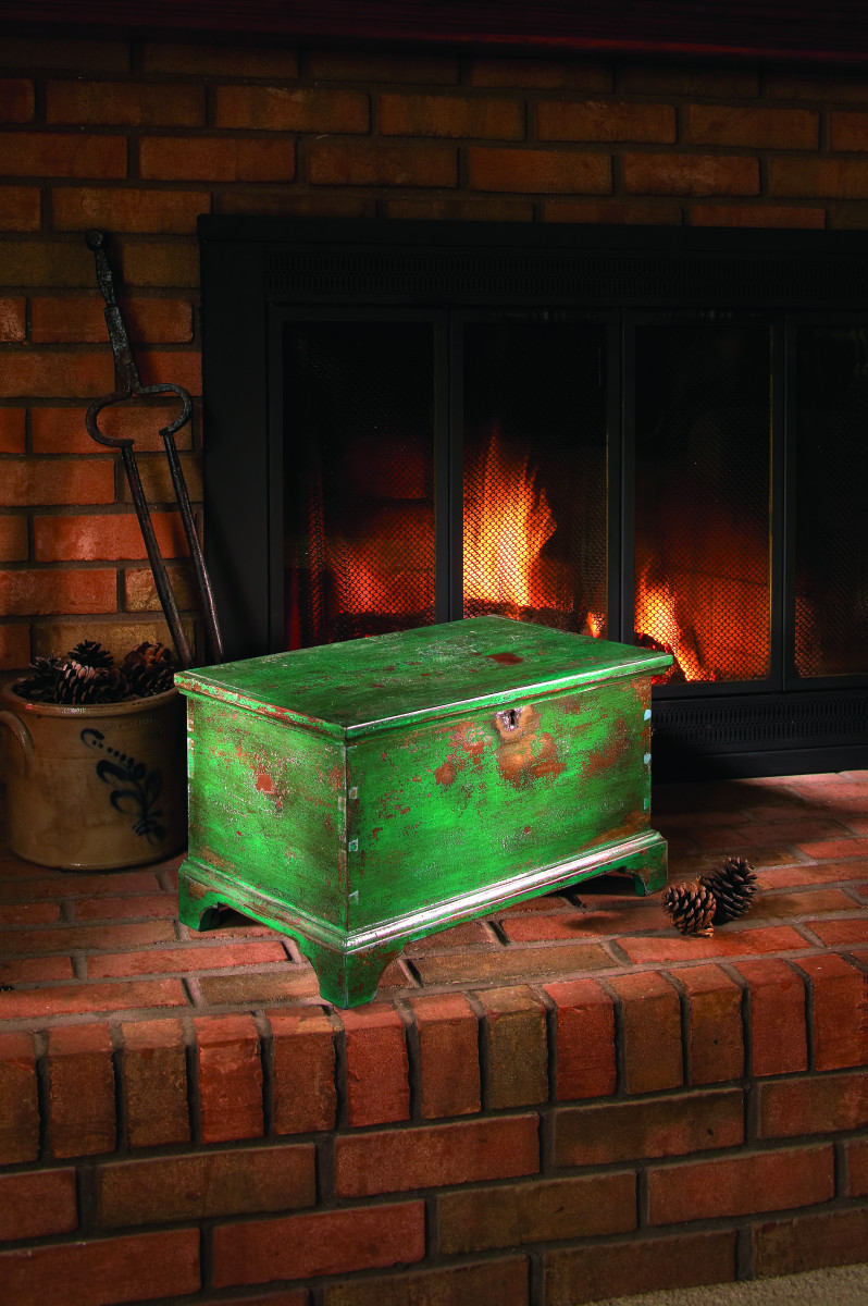
Add centuries of wear and tear to your projects using a tested formula that’s simple and safe – no open flame!
This is the furniture finish that fooled our local auctioneer, a man with 30 years of experience selling antique furniture and farm equipment.
I had bought a mower from the auctioneer and he was dropping it off at my workshop when he spotted one of my furniture pieces that sported what I call a barn finish.
He walked over to the piece and asked what I’d repaired on it. I replied that it wasn’t an antique that needed fixing; instead, I had just finished building it and was about to deliver it to a customer.
He didn’t believe me.
After a few minutes of debate, I finally turned the piece over to show him a spot of new, raw wood that was unfinished.
“In all my years,” he said, “I have never seen a finish like that.”
New Finish That Looks Old
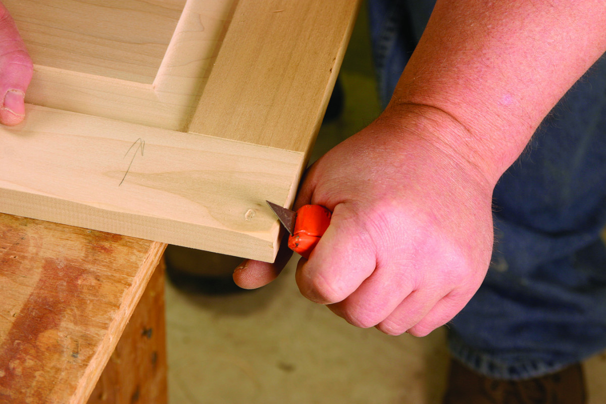
When adding age to your projects, work the edges of the doors and drawers especially. These get the most wear and tear in the real world.
While I don’t think this finish would fool an expert on antique furniture, it is a convincing way to add centuries of patina to your projects so they will fit in with an older home or other pieces of antique furniture.
This finish is my favorite to do. You cannot mess it up. Even if you don’t like the final result, you can simply add another coat of lacquer and paint until you get the look you want. Every layer simply adds more texture to the project and makes the finish look better.
Unlike many antiqued painted finishes, this one is safe enough that I allow my daughter to do it. Other finish processes involve a stage where you char a layer of paint with a gas torch or by setting the piece on fire. I’ve tried those methods but I don’t like them. And I’m sure my insurance company would agree.
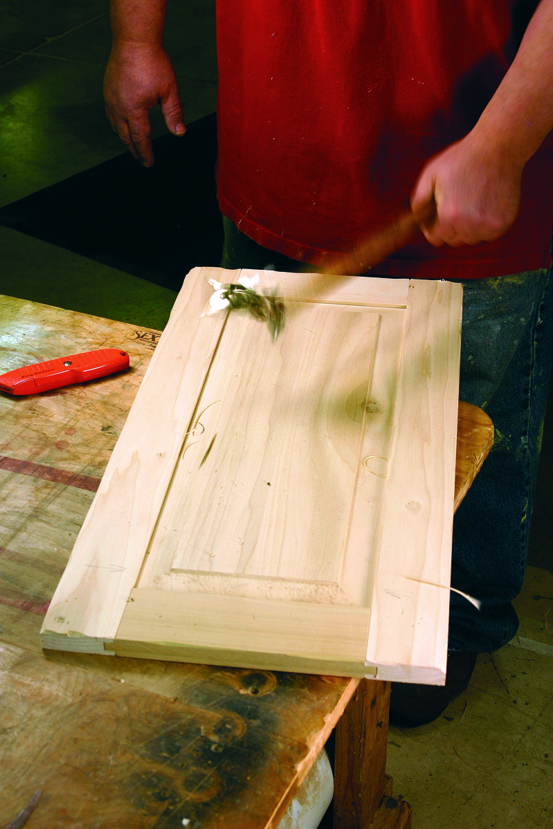
One of the most effective tools for adding years to a project is a small bunch of keys on the end of a stick. When visitors to my shop see me beating my projects with this tool they freak out.
Instead, I use a high-temperature heat gun. Look for one that reaches 1,500° Fahrenheit – these are available at industrial supply stores. The 1,000°-degree heat guns will work, but the hotter one is better. Heat guns are a bit slower than a torch, but they’re safer. And I’ll show you how to save some time by skipping a coloring step that makes no difference to the finished look of the piece.
Whenever you use this finish, be sure to practice on a sample board at each stage before you move onto the finished project. That way you’ll see what the next step is going to look like. And when you are done, you’ll have a great sample board to keep.
Begin With Abuse
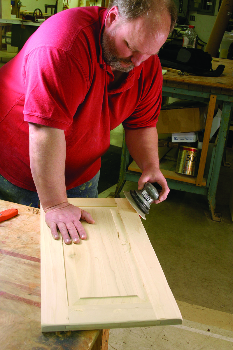
After you are done aging your project, there’s one last step: Sand smooth the sharp edges you created with your knife and other tools. This step helps blend the old with the new.
Before you add color, the first step is to mimic 200 years of use and abuse to the piece. I use a utility knife to chamfer edges, a drill bit to create worm holes and an awl to make bite marks from a dog. To demonstrate lots of wear, use a chisel to imitate a mouse hole. Heat a tin can and place it on the wood to char it. At the end, beat it with a cluster of keys then sand the edges with a power sander.
Aging requires a little creative thinking to decide what areas of the project would see the most scuffing, but it will be obvious if you first look at some real antiques. Concentrate on the base, the knobs, mouldings, doors and drawers. Let the kids help – they’ll require little training.
Don’t Begin With Stain
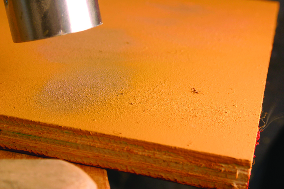
After a coat of your base color, a coat of lacquer and a second coat of your base color, use a heat gun to blister the paint.
At its heart, this finish begins with a layer of paint, then a coat of lacquer then another coat of paint. You then blister and scrape your top coat of paint and repeat the whole process again. Then, at the end, you wipe on a glaze to add grime and a coat of dull lacquer to seal it all in.
Some other antique finishes recommend that you start by staining the entire piece and then add the paint. I’ve done this many times myself, and I think you can skip that step. Any raw wood that you expose during the aging process will be colored by the glaze in the end. And in all my years of doing this finish, I’ve never had the finish peel, so I think a base coat of stain is unnecessary.
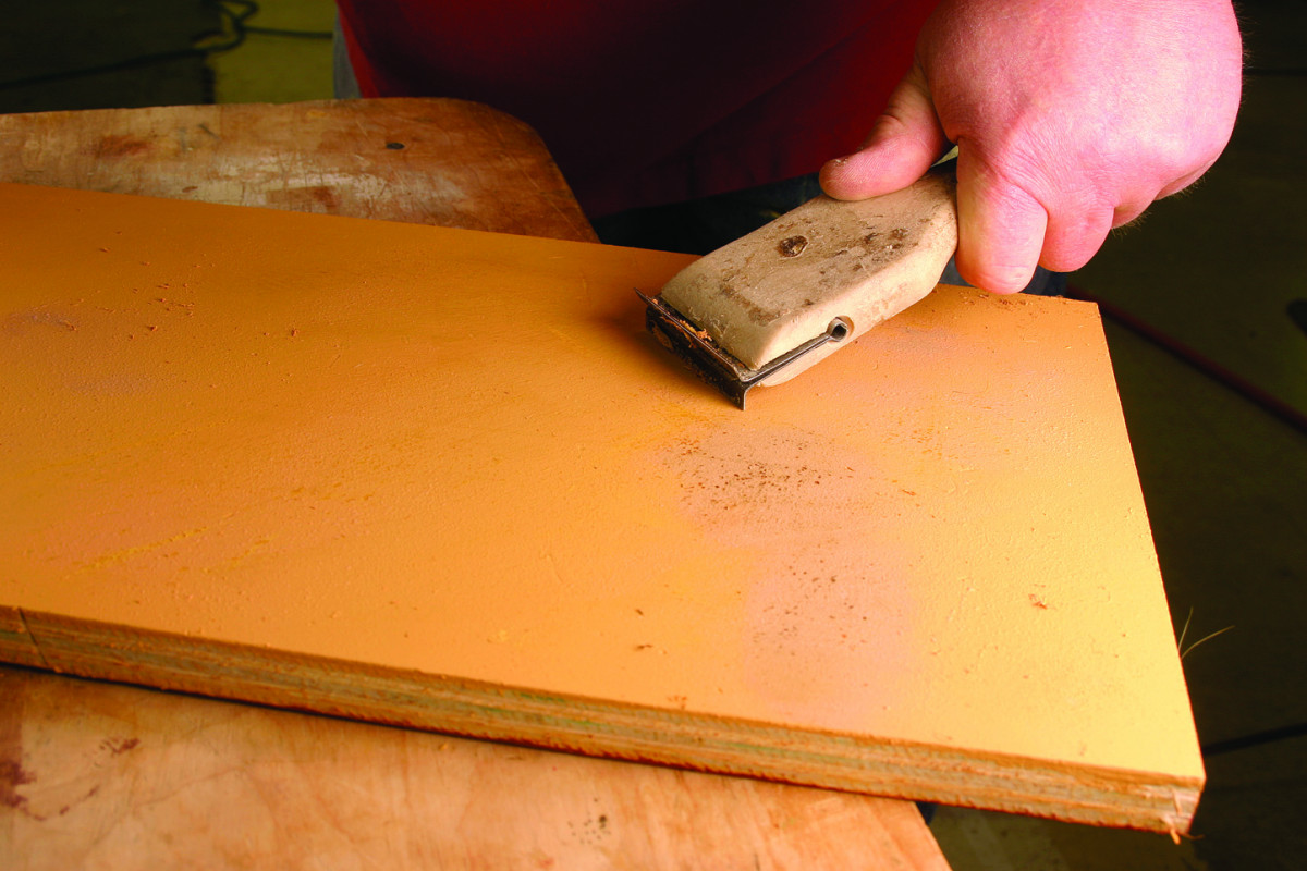
Scrape off the blisters with a common paint scraper. You don’t have to use a lot of downward pressure. Stop scraping when you’ve popped all the blisters off.
Begin by brushing on a coat of latex paint. (Hint: Allow the brush to fall on the floor and get some sawdust on it.) Let the paint dry. If some areas of the paint look thin, add a second coat.
Now spray on a coat of lacquer (or brush on a coat of brushing lacquer) and add another one or two coats of the same color paint. Let it dry and get your heat gun.
Lacquer Then Paint; Blister Then Scrape
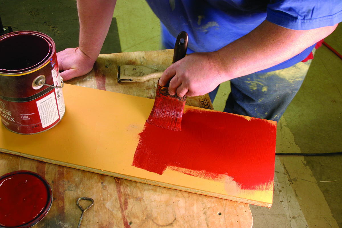
After a coat of lacquer, apply the second color of paint with a brush. If the brush has fallen on the floor and picked up some sawdust, that’s all the better.
Hold the heat gun close to the surface and move it slowly across the piece. After a few minutes the paint will bubble and blister.
Use your judgment here. The more blistering, the more texture you’ll end up with. If you overdo it, simply add more paint and try the process again.
With the paint blistered, use a paint scraper to remove the bubbles. Get the surface somewhat smooth but don’t get too aggressive. The little ragged edges of paint you leave behind will add texture to the surface.
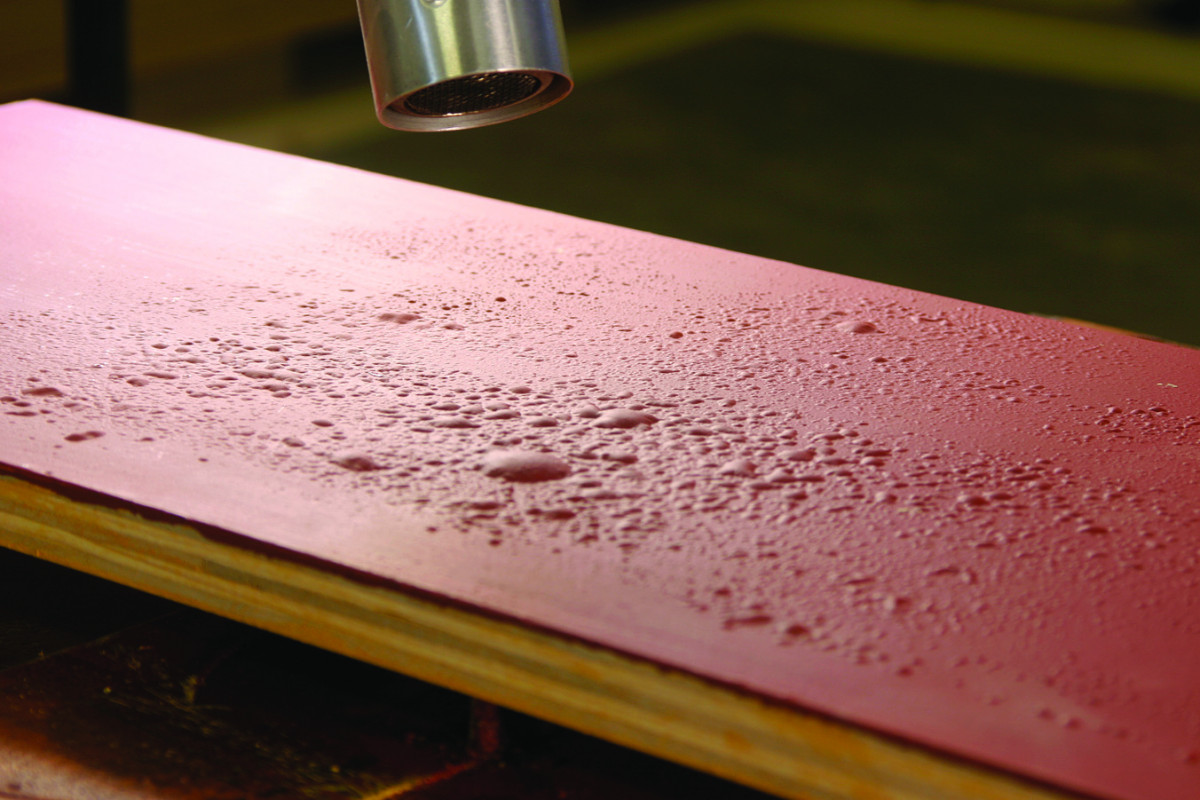
After another coat of lacquer and then paint, blister the top color with your heat gun. The more blistering, the more base color will show through.
Now apply another coat of lacquer and brush on one or two coats of your second color of paint (see “Choosing Color” on page 83 for some ideas on color combinations).
Then blister the paint with your heat gun and scrape the bubbles away. This will reveal patches of your first color below.
If you don’t like the look, add more lacquer and paint; then blister and scrape it until you are pleased. Then take some worn sandpaper (the grit isn’t critical – but not too aggressive) and level the blistered surface to smooth over the really rough spots.
Final Color and Topcoat
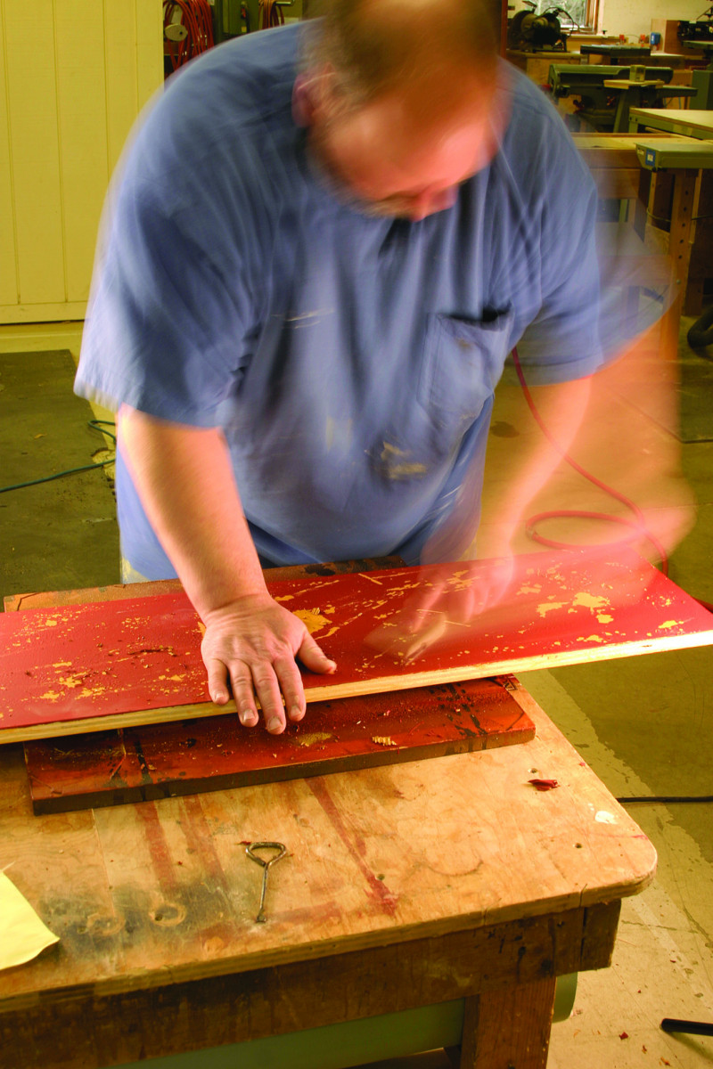
Scrape the top coat of blistered paint until you see a satisfying amount of your base color. This is a matter of taste, of course, but there is no wrong way to do it.
The final coloring step adds the real age. I wipe on a fast-drying brown glaze that is compatible with my lacquer. Glazes are available from professional paint stores. The exact color isn’t critical.
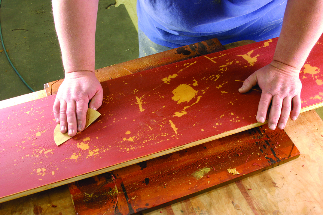
Use a piece of worn sandpaper to smooth out the artificial wear and tear you’ve introduced. This will knock off the large bits of paint, but still leave some texture.
You could use a gel stain or liquid stain instead of a product labeled as glaze. But liquid stains soak into the paint more than I like and take longer to dry. (All coloring that takes place between coats of finish is technically glazing, but you can use a variety of products for the process.)
When the glaze is dry, add your final topcoat. I like a dull lacquer; gloss just wouldn’t be right.
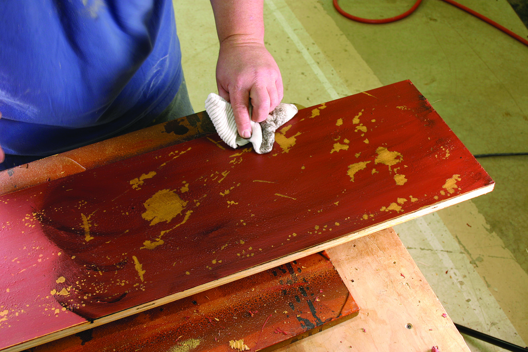
Rag on a brown or black glaze. The glaze will mute your colors and build up in the texturing you’ve created. This is where you’ll start to see the final effect of your efforts.
The best part of this finish is that there is no wrong way to do it. If you’re not satisfied, put another coat of paint on. Every single layer makes it look better.
And what if you do something wrong and the finish starts to peel? No problem. Antique finishes peel. It might even look better in the end. PW
Choosing Colors
In general, I like to choose paint colors that are brighter than you might expect. I like bright blues and teal greens, especially on smaller pieces.
My rationale for liking the wild color is that early American pieces were typically painted in bright colors to help brighten up dark rooms. Plus, once you add the glaze to the surface, the colors become a bit muted.
When you go to choose colors, I think it’s best to go to the home center or paint store and pick a couple colors from the store’s “historical” palette of paints. Everybody’s got one these days. How authentic are they? I don’t know, but they look good.
During the last couple decades, here are some of my favorite color combinations:
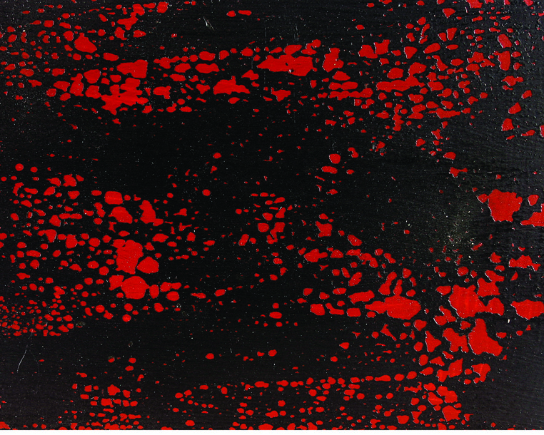
Black on red
• Black over red is the most popular combination. Red over black works too.
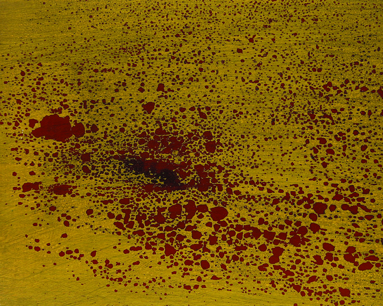
Yellow on red
• My wife, who has excellent taste in these things, really loves yellow over red.
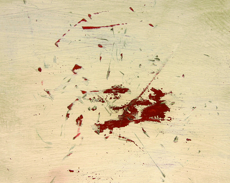
Off-white on red
• Off-white looks really good over brown or brick red. It doesn’t, however, work over black.
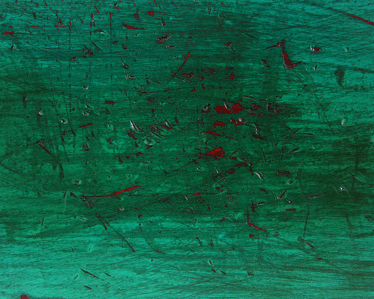
Teal on red
• Green over black or red are both good choices.
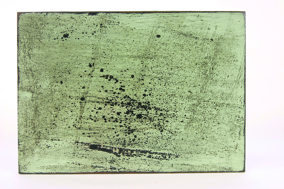
Sage on black
• Sage green over black and dark blue over black are both nice combinations.
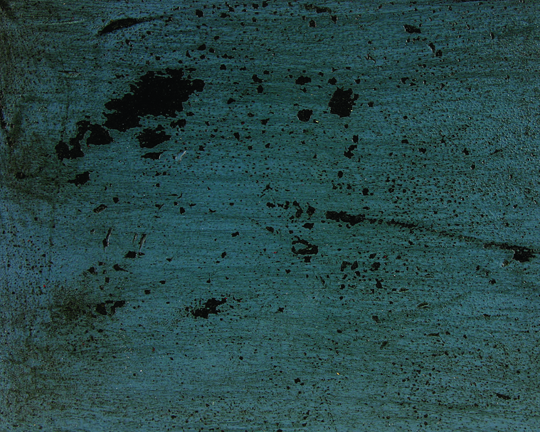
Blue on black
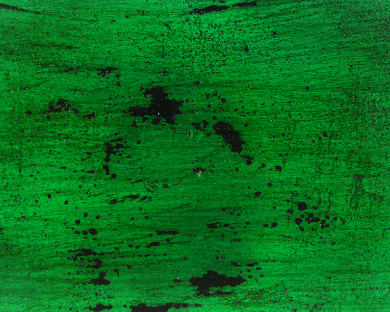
Green on black
• A little on the wild side perhaps, teal over red is a vibrant choice.
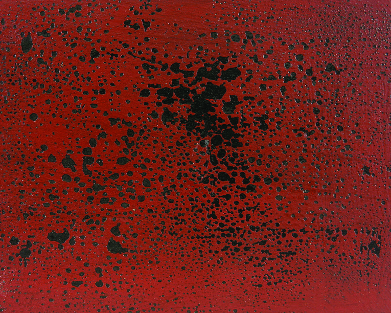
Red on black
Before trying a wild combination on a large piece, give it a try on a small one to see how it looks. I think you’ll be surprised by how good the bright colors look with this finish.
Here are some supplies and tools we find essential in our everyday work around the shop. We may receive a commission from sales referred by our links; however, we have carefully selected these products for their usefulness and quality.


