We may receive a commission when you use our affiliate links. However, this does not impact our recommendations.
I have been designing and building in the Greene & Greene style since 1991. I have made a serious study of their work. One of the things I find truly astonishing is the level and subtlety of detail. I am amazed, after all these years, upon visiting the Gamble House, to still discover some new design element that I never noticed before. What makes this so incredible is that I have studied these pieces intensely for a very long time, and yet still find myself unlocking their secrets.
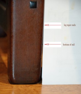
 The Greenes were simply not willing to compromise when it came to design. Details, no matter how slight or subtle, were not sacrificed – even in the face of considerable work. The taper seen on the lower leg of the Thorsen Server is ever so slight. Upon closer look you might wonder if your eyes are playing tricks on you; does the taper extend past the point where the rail meets the leg? It in fact does, as seen in the photo. Oddly, the leg does not show any sign of housing the rail. This means the rail was scribed to the taper in the leg! A lot of work for such an understated detail, but it was a such a treasure to discover!
The Greenes did not treat design as a practice of simple cut and paste. Every time an element was used, it was considered for context. This often meant a “makeover” of the detail.
A little web-surfing over to the Greene & Greene Virtual Archives will confirm this…..
http://cwis.usc.edu/dept/architecture/greeneandgreene/searchbasic.html Browse the photos and use the zoom feature to get up close and personal.
As a for instance, zoom way in on the bottom of the leg of this piece from the Gamble House master bedroom…. http://dpg.lib.berkeley.edu/webdb/ggva/sid?filename=GGUSC-Gamble-DA-093
Notice the spacing of the step downs on what I call the “waterfall detail”.
Next zoom in on the bottom of the leg of this piece, also from the same room…
http://dpg.lib.berkeley.edu/webdb/ggva/search?project=&siteid=157&pageno=16&id=GGUSC-Gamble-DA-097
The spacing of the step downs are reversed from the previous piece. I must tell you: This made me a little nutty for a while. There had to be some rhyme to this.
Examining the other pieces in the room with this detail, I eventually made sense of it, at least to my personal understanding. This is a story in itself (maybe in another post) and not without a good measure of mental torment.
The details of details of Greene & Greene is material for years of study. The nuance within nuance is overwhelming. Every minute detail had a purpose. To think that the bulk of their mature period was produced in a mere 8 years or so – is enough to give one an inferiority complex.
Here are some supplies and tools we find essential in our everyday work around the shop. We may receive a commission from sales referred by our links; however, we have carefully selected these products for their usefulness and quality.


Thanks Darrell, I am also considering building a lot more G&G pieces. I tend to stay away from the overtly-swoopy Asian elements in some of their work I’ve seen, as it is not appealing to me in general. However, the designs used in most of their work are simple, elegant, beautiful. I work primarily with white oak and wenge for the buttons. It may seem redundant to use an ebony stain on wenge, and the grain is a little coarse, but to me it’s the next best thing to using ebony which is rather like buying gold these days.